Peichi Jiang

AZUL

Logo, Branding and Web Design

Overview

AZUL is a future-forward business campus developed by Baker Development in the heart of Phoenix, designed to attract high-tech companies and data centers.

The Problem

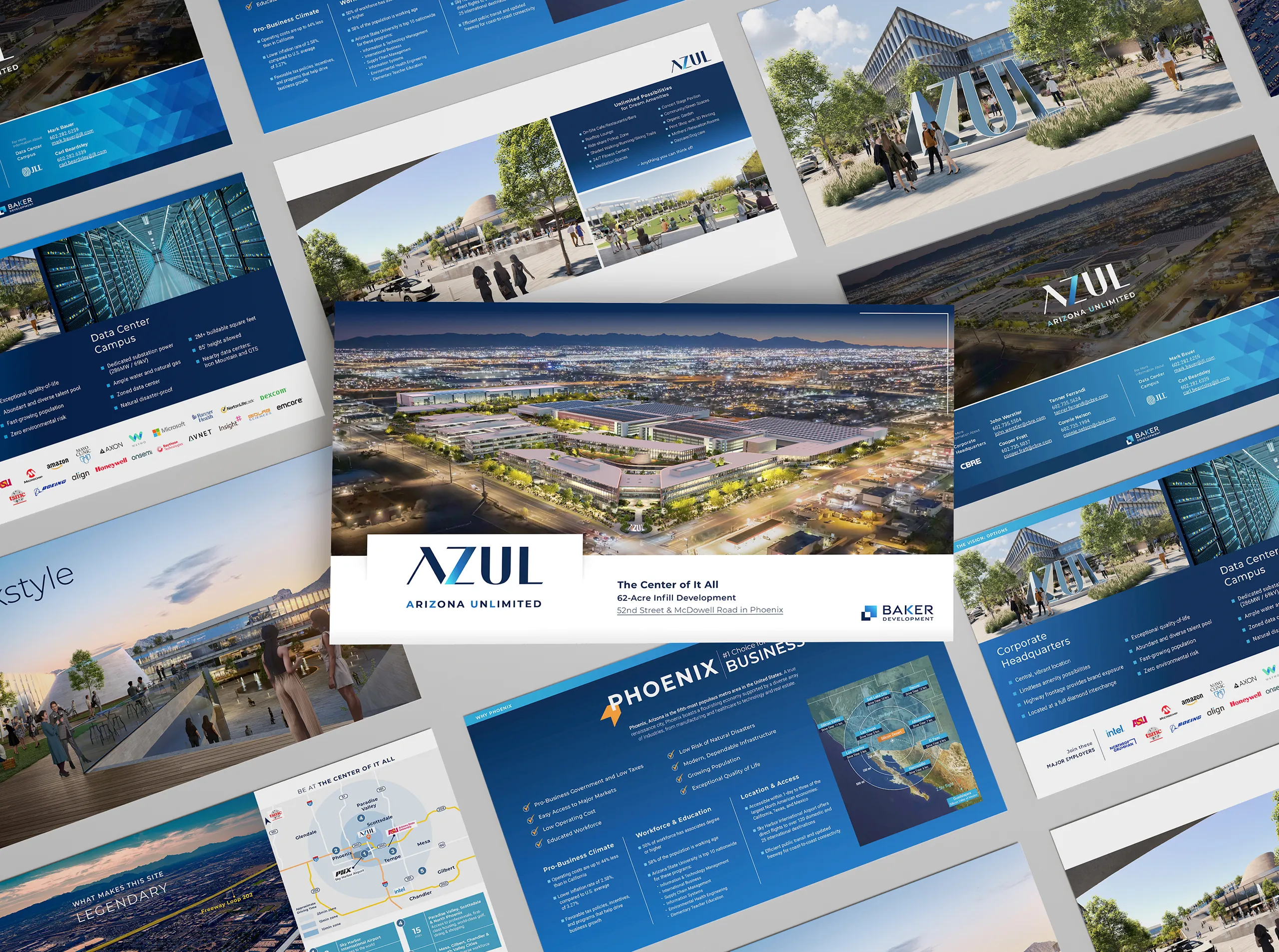
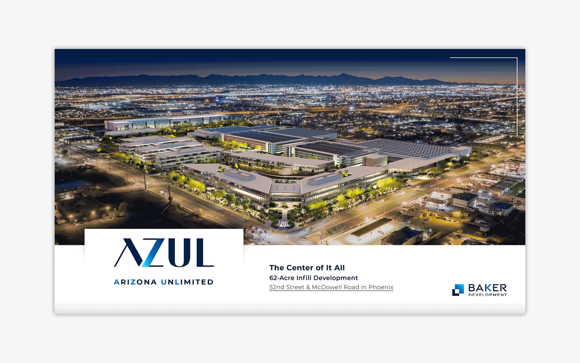
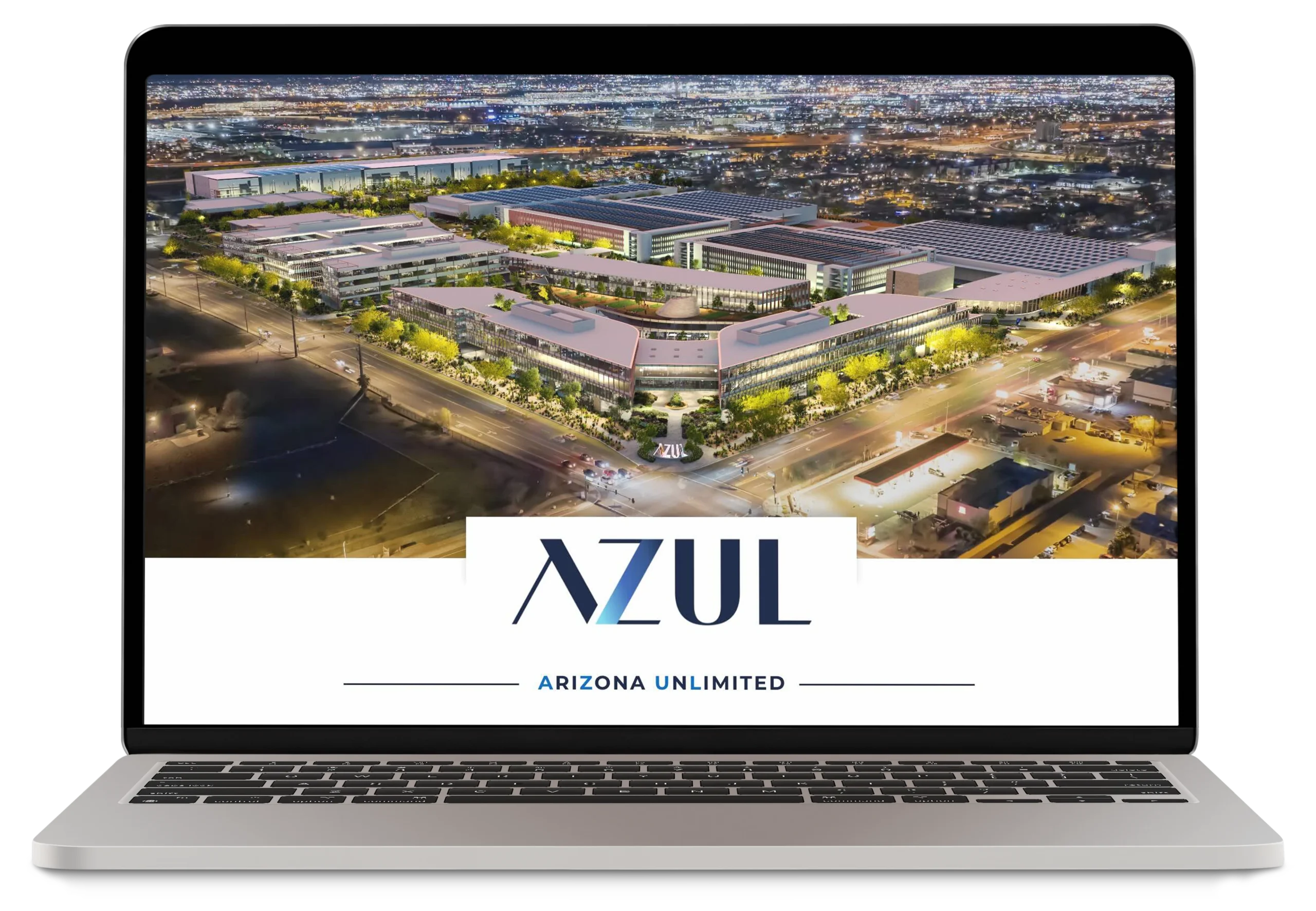
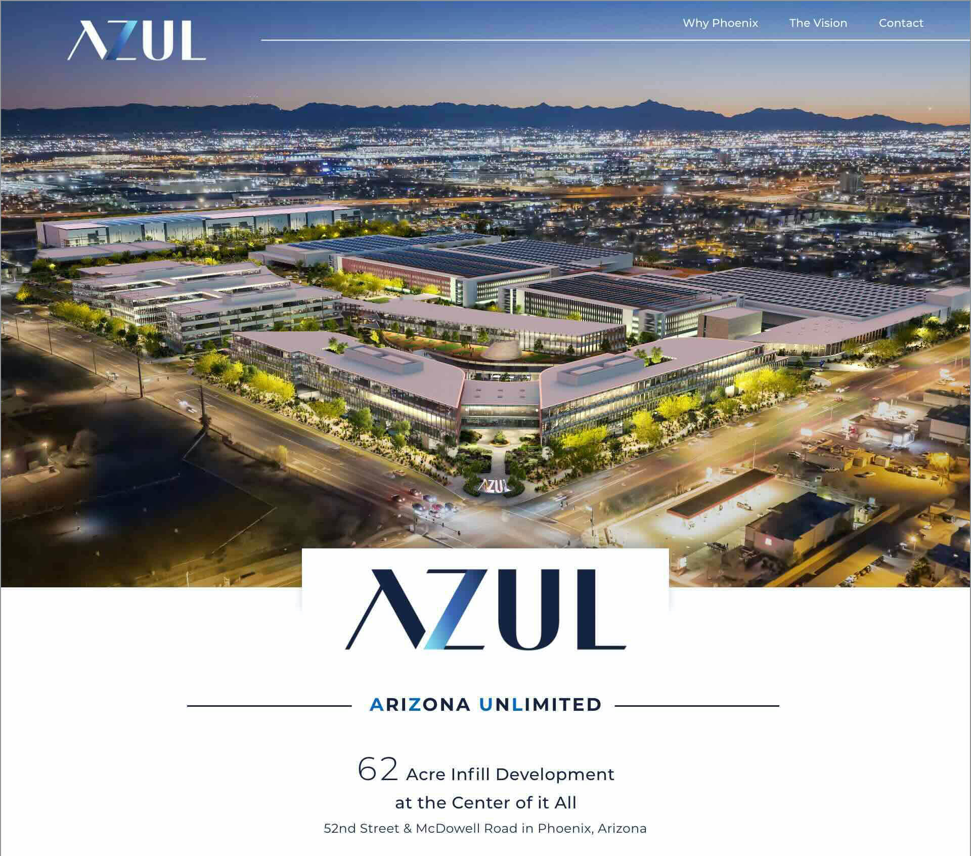
While the name “AZUL” (short for Arizona Unlimited) had strong conceptual meaning, there were concerns before seeing the logo concepts about whether the name felt modern, innovative, and compelling enough to represent a technology-driven development.

Our Solution

I led the logo design to elevate the name through form and symbolism. A stylized “A” conveys upward momentum and innovation, while the gradient “Z” introduces a digital sensibility and sense of limitless potential. The refined yet confident “U” and “L” ground the identity in professionalism. The client immediately embraced the direction, which led to additional work including web design and digital marketing materials.

Recognition

AZUL Brochure – 2025 Marcom Award

Color Palette

Graphic Elements/Pattern

Let's Work Together to Achieve Your Goals!