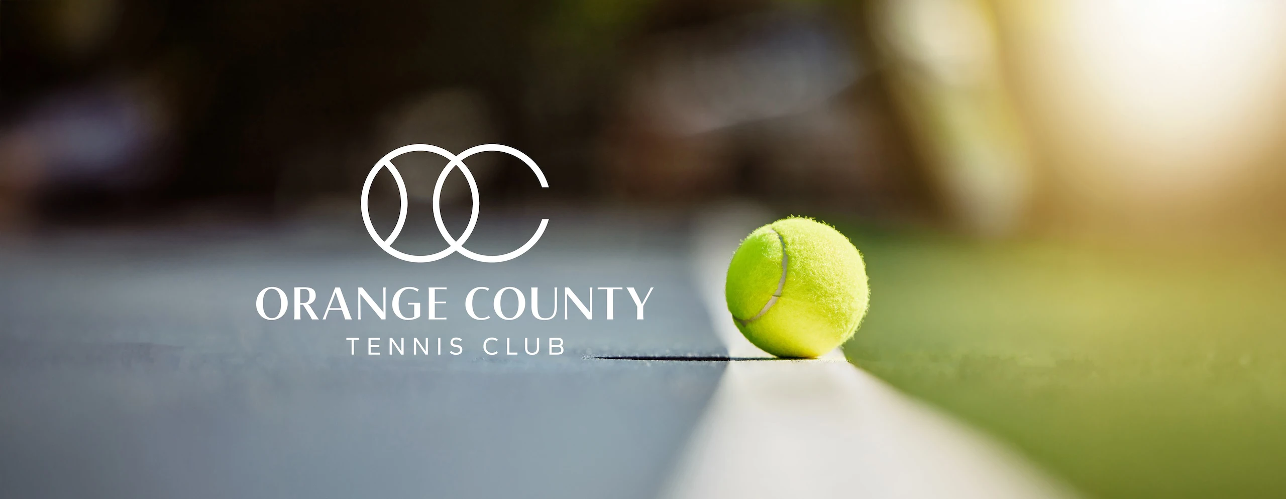
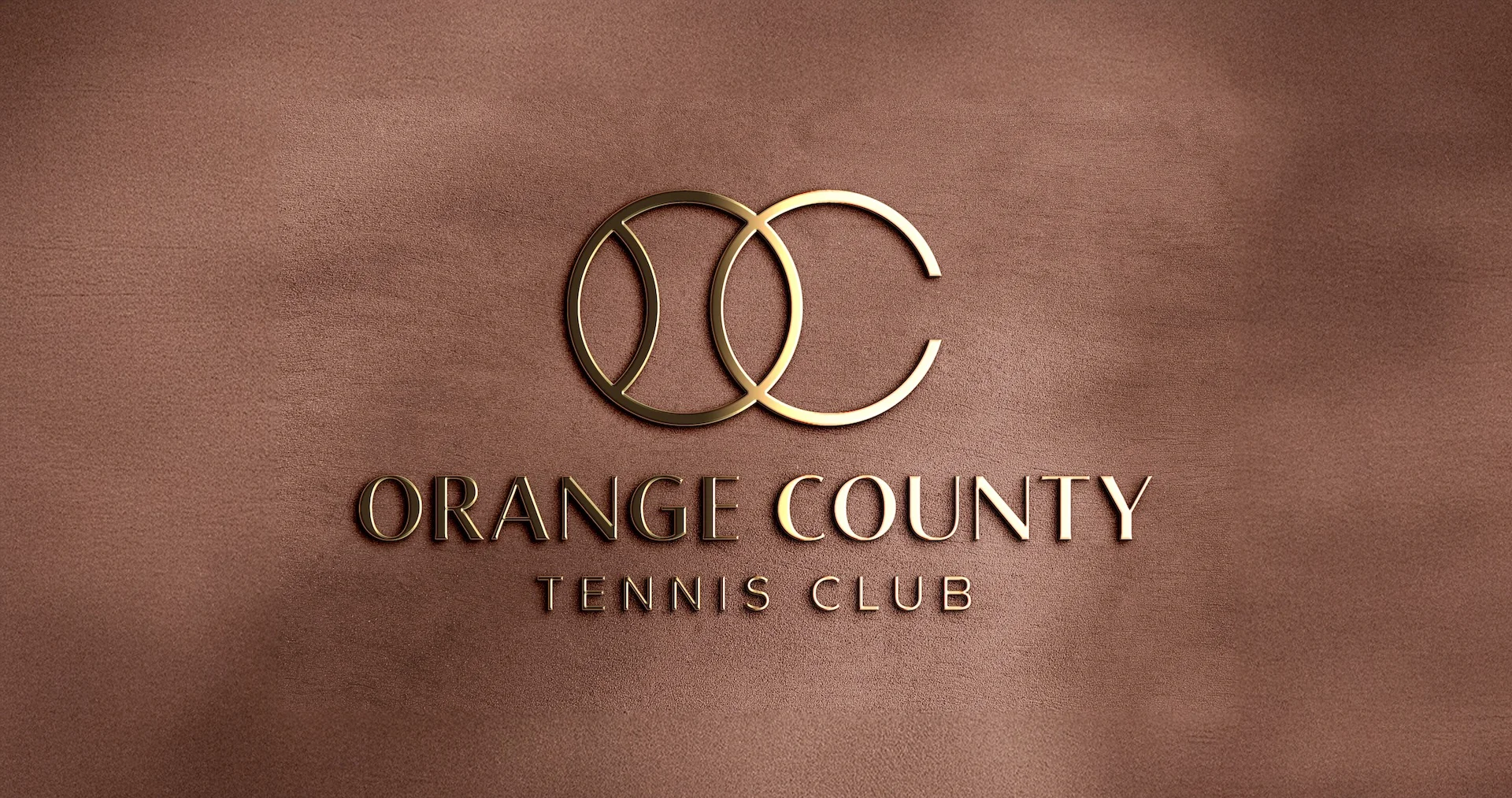
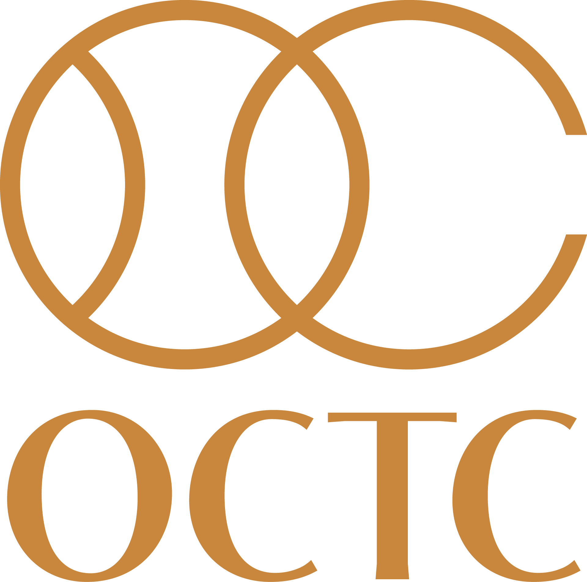
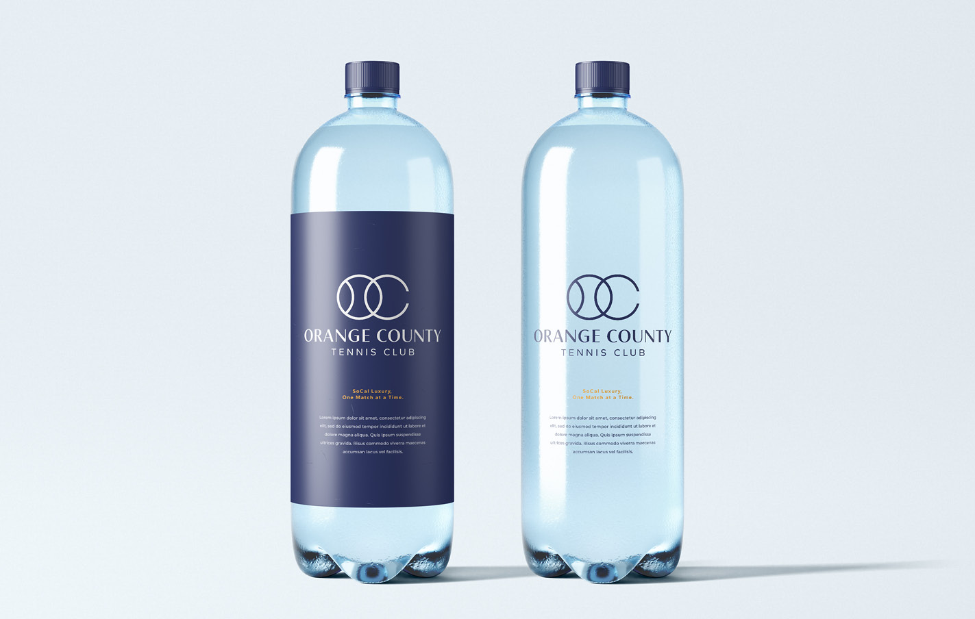
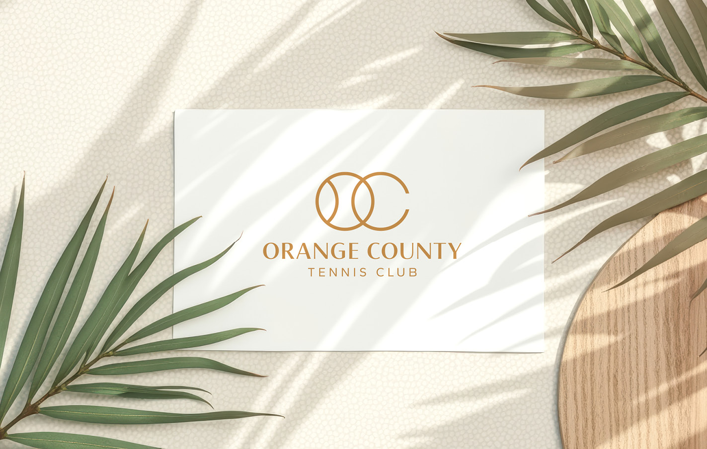
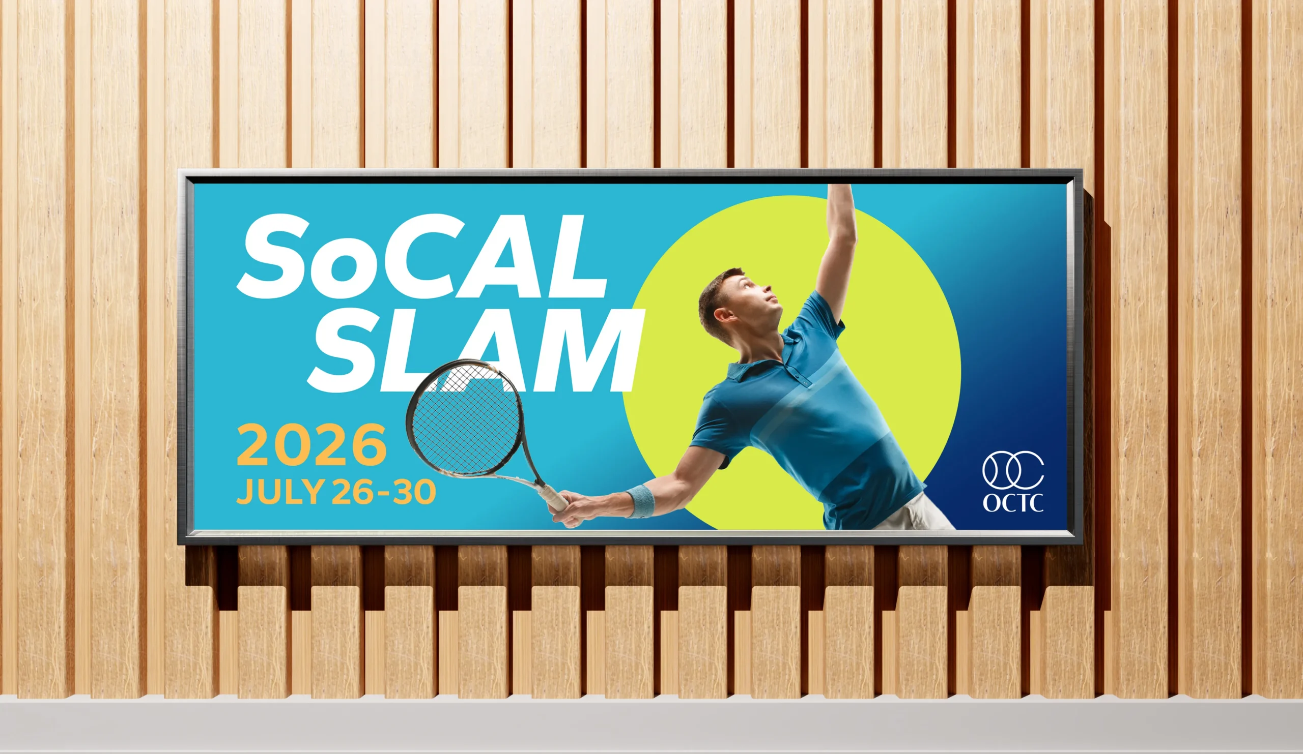
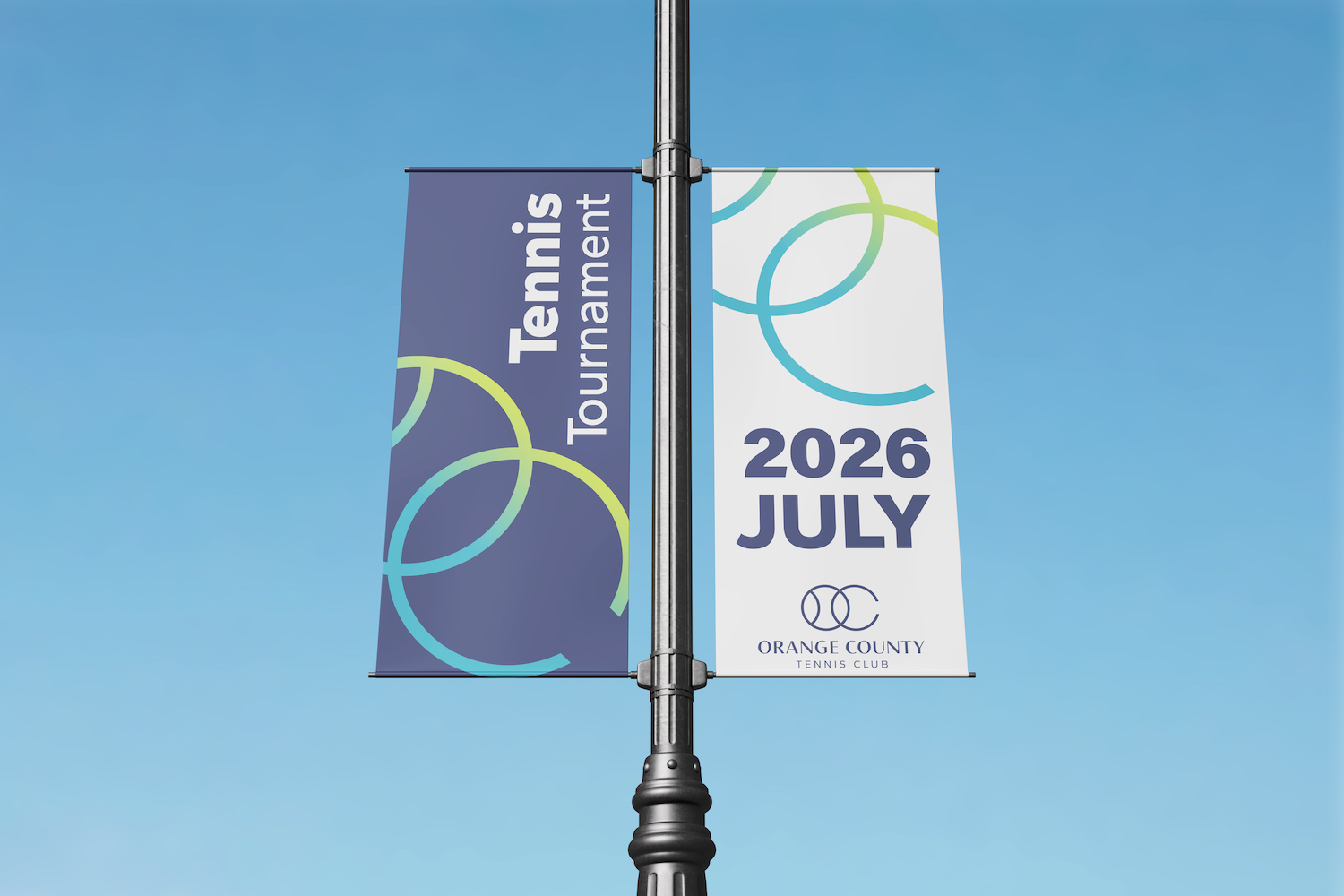
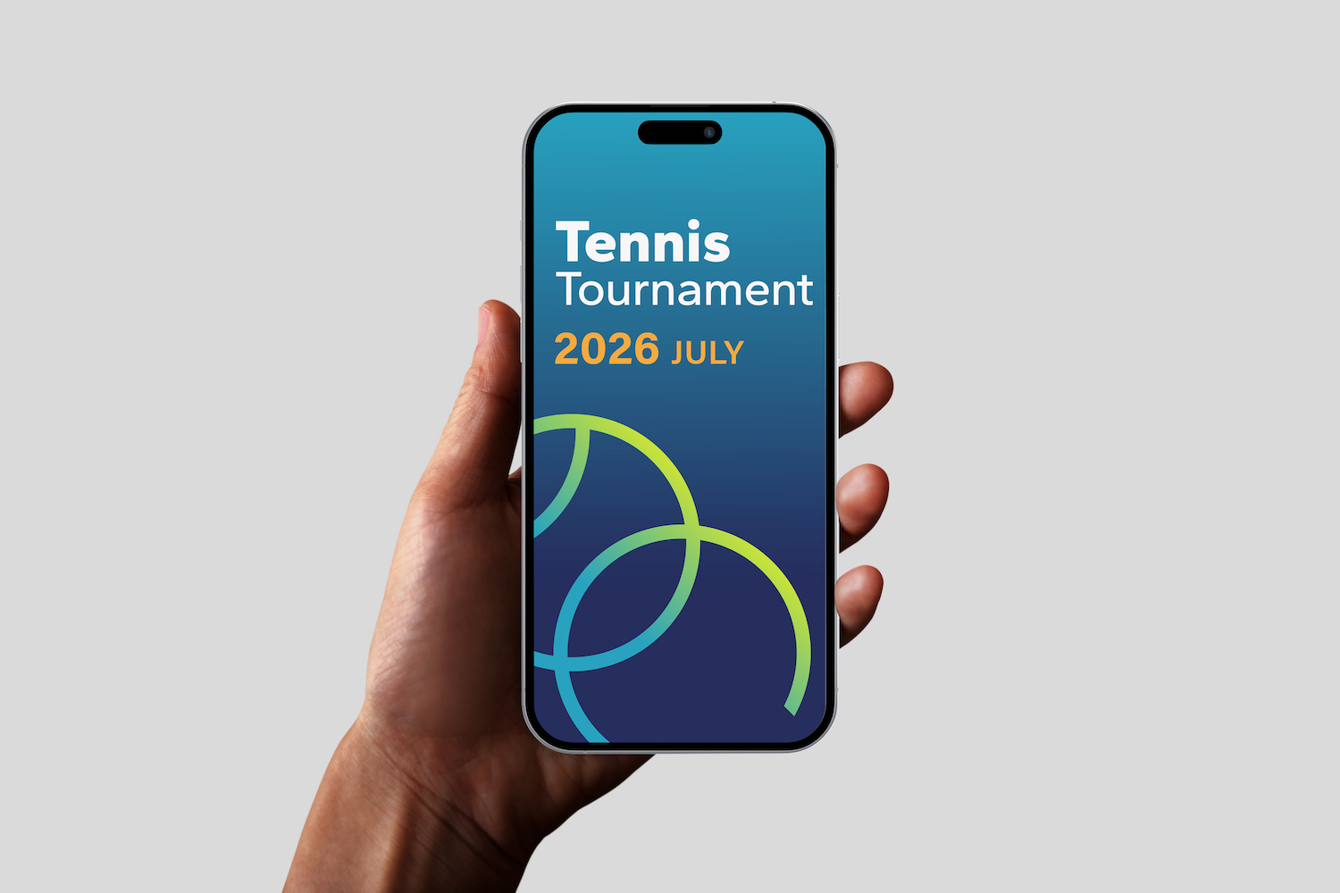
This project focused on creating a distinctive logo and brand identity for the Orange County Tennis Club. The client envisioned a brand that feels high-end, elegant, and luxurious—while also needing a more vibrant, energetic look for tournaments and special events.
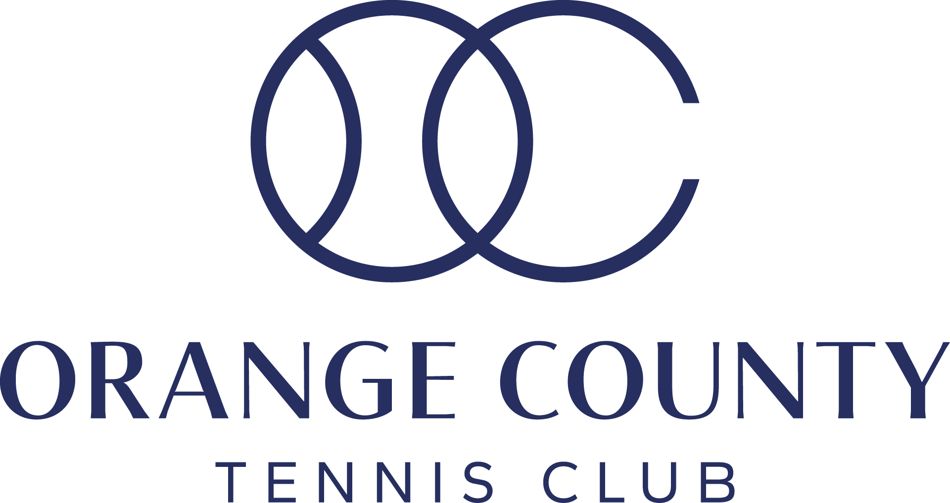
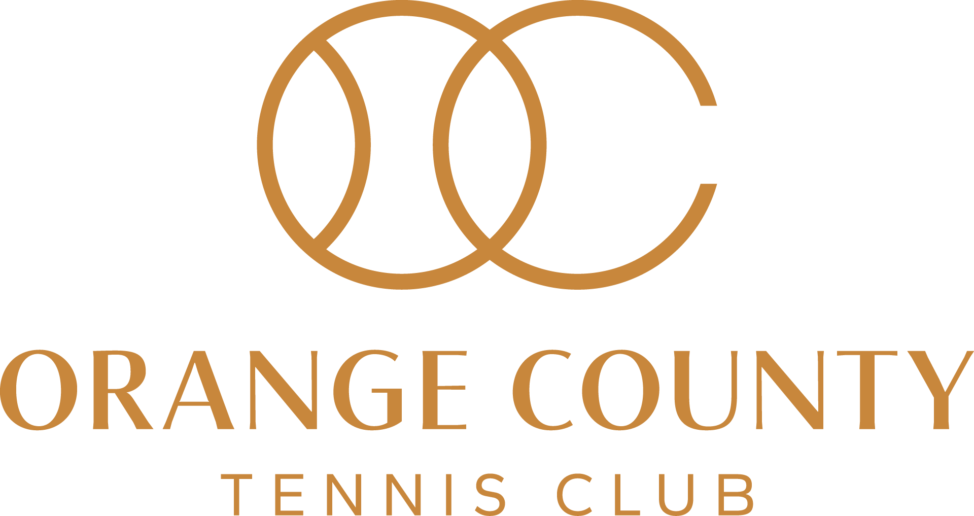
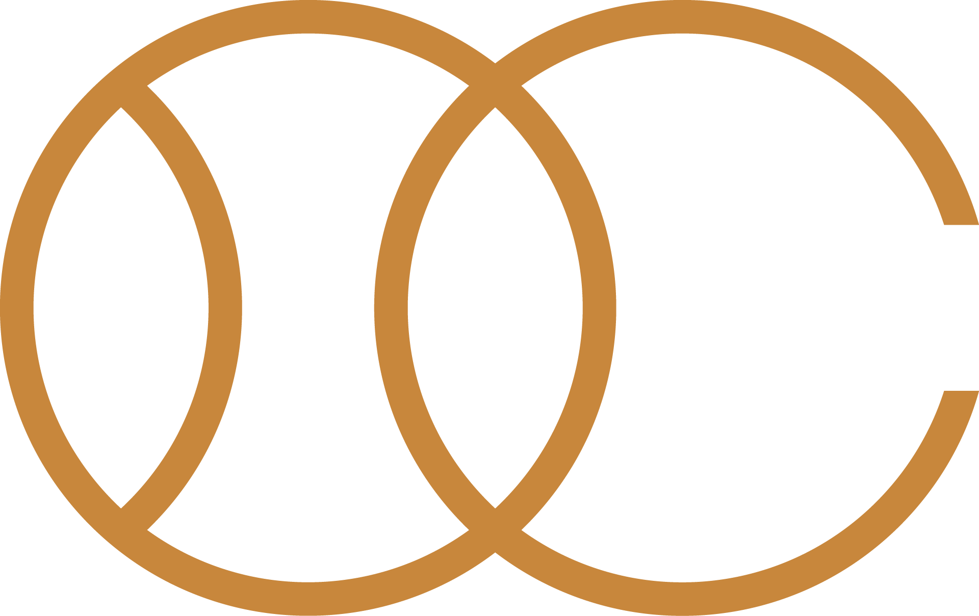
To meet this dual purpose, we designed a versatile logo that integrates the initials “O” and “C” into the shape of a tennis ball. Paired with a sleek, modern typeface, the logo projects a polished, high-end image in line with the club’s core identity. The “OC” mark also functions as a standalone graphic element, adding flexibility across various applications.
The result is a happy client with a brand identity that seamlessly adapts to both the club’s everyday elegance and its lively event atmosphere.